 Fits Every Screen
The mobile-first approach
Last reviewed
The short version
- Mobile first means you design the small-screen version first.
- Then you add to it as the screen gets wider.
- In CSS, that usually means
min-widthqueries. - It keeps the simplest layout as the default.
The idea
A common approach is to start with a simple single-column layout for narrow screens, such as phones. Then you check for wider screens and add a multi-column layout once there's enough room.[1] Designing this way is called mobile-first design.[1]
The opposite is "desktop first". You build the big layout, then fight to squeeze it down. That tends to mean undoing rules you wrote earlier.
What it looks like in CSS
Here's a layout built mobile first:
.page {
  display: block;
}

@media (min-width: 40rem) {
  .page {
    display: grid;
    grid-template-columns: 1fr 1fr;
  }
}

@media (min-width: 70rem) {
  .page {
    grid-template-columns: 1fr 1fr 1fr;
  }
}
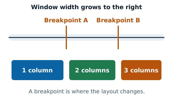
Read it top to bottom. The first rule has no condition, so it's the phone layout. It stays for everyone.
The next rule adds two columns once the window is at least 40rem wide. The last adds a third column at 70rem. Each query builds on the one before. You only ever add.
The media queries page explains the syntax in more detail.
Why it helps
Your default is the simplest layout. One column needs almost no CSS. If a browser ignores your queries, readers still get a usable page.
You decide what matters. A small screen has no room for clutter. You have to choose what's important. A traveler on a travel site might want only flight times and delay information, not a decorative globe.[1]
Phones still have limits. Today's phones can handle the same technology as desktops. But battery life and bandwidth are still concerns.[1] A lean default respects both.
An older idea in new clothes
Mobile-first isn't new. Wikipedia notes that mobile-first design and progressive enhancement are related ideas that came before responsive design.[2]
Progressive enhancement means building a basic version that works for everyone, then improving it for better devices. In the early days, a recommended practice was to create a basic website and enhance it for smartphones and personal computers.[2]
A rule of thumb
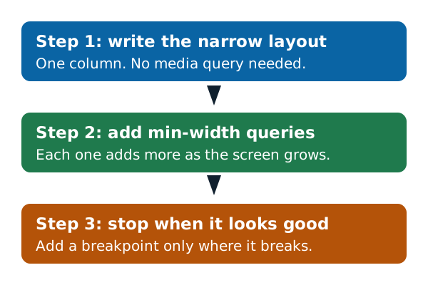
Don't add a breakpoint until something looks wrong. Narrow first, widen the window slowly, and add a min-width query at the point where the layout starts to look stretched.
You can check each result with the steps on the testing page. To keep going, look at the fluid layouts page for how the columns themselves flex between breakpoints.
Sources
- Responsive web design, MDN Web Docs (accessed 2026-11-07)
- Responsive web design, Wikipedia (accessed 2026-11-07)