 Fits Every Screen
Media queries and breakpoints
Last reviewed
The short version
- A media query is an if-test written in CSS.
- If the test is true, the rules inside it apply. If not, they're skipped.
- The width where your layout changes is called a breakpoint.
- Pick breakpoints where the content breaks, not from a list of phones.
An if-test for your styles
A media query lets you apply CSS styles depending on the kind of device, or on things like screen size.[1] The kind can be "screen" or "print", for example. A feature can be width, orientation and more.
The query is true when its parts all match the device showing the page.[1] When it's true, the styles inside it switch on. When it's false, they sit unused.
Reading one
Here's a small example:
.page {
  display: block;
}

@media (min-width: 40rem) {
  .page {
    display: grid;
    grid-template-columns: 1fr 1fr;
  }
}
The first rule is for everyone. The second only applies when the window is at least 40rem wide.
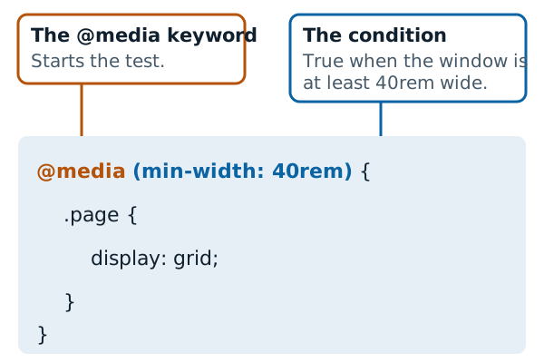
What's a rem? It's a unit based on the page's base font size. MDN's example says 4rem means four times that base size.[2]
Widths in a query often start with min- or max-. Range features can be prefixed that way to mean "at least" or "at most".[1] MDN's example applies styles only when the viewport width is equal to or narrower than 1250px.[1] That's a max-width test.
Other features exist too. Orientation, for example, is either landscape or portrait.[1]
What a breakpoint is
Add several queries and your layout changes at several widths. The points where a query kicks in and the layout changes are known as breakpoints.[2]
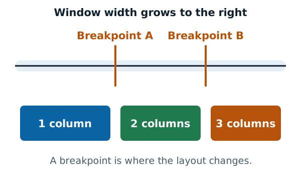
Below the first mark you have one column. Past it, two. Past the next, three.
Where to put breakpoints
It's tempting to copy widths from popular phones. Best practice says otherwise. MDN encourages defining breakpoints with relative units, not the absolute sizes of an individual device.[2]
A better method is to let the content tell you. Narrow the window and watch. If a box gets squashed with two words on each line, that's where you set a breakpoint.[2]
Add as few as you need. Each one is another layout to test.
Not just for layout
Queries can change more than columns. You don't have to limit them to the page layout.[2] You could make a heading smaller on small screens or hide a decoration.
Do you always need them?
No. Media queries can help, but they're not a requirement.[2] A well-built flexible layout, as described on the fluid layouts page, may need few or none.
When you do write them, one order of work keeps things simple. Start from the smallest screen and add on. That's the mobile-first approach.
Sources
- Using media queries, MDN Web Docs (accessed 2026-11-07)
- Responsive web design, MDN Web Docs (accessed 2026-11-07)