 Fits Every Screen
Responsive images
Last reviewed
The short version
- One big image on every screen wastes data on phones.
srcsetlets you list several sizes of the same picture. The browser picks one.- The
pictureelement lets you swap in a differently cropped picture. - Always keep a normal
imgtag withaltinside.
This page is about picking the right image for the screen. It isn't about file types or compression. Those are covered elsewhere.
Two different problems
Shrinking one big image to fit a small screen wastes bandwidth. The phone still downloads the whole large file.[1] MDN notes that mobile users don't want to download an image meant for desktop users when a small one would do.[2]
The other way round has a cost too. A small image stretched large starts to look grainy.[2]
There are two problems here, and they need two tools.
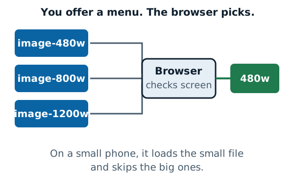
Problem one: the right size (resolution switching)
You want the same picture, just bigger or smaller. HTML's srcset and sizes attributes handle that. You list several files and add hints. The browser then chooses.
<img
  src="photo-800w.jpg"
  srcset="photo-480w.jpg 480w, photo-800w.jpg 800w, photo-1200w.jpg 1200w"
  sizes="(width <= 600px) 480px, 800px"
  alt="A short description of the photo">
Here's what each part does:
srcsetis the menu. It defines the set of images the browser may choose between, and the size of each.[2]- The
wafter each number is the image's real width in pixels. It uses awunit, notpx.[2] sizesgives hints. It lists media conditions, like screen widths, and the best image size when each is true.[2]
In this example: when the window is 600 pixels wide or less, plan for a 480 pixel slot. Otherwise plan for 800.
If no file matches the slot exactly, the browser picks the first image that's bigger and scales it down.[2]
The savings can be real. In MDN's demo the 800 pixel picture is 128 KB, and the 480 pixel version is only 63 KB.[2] Across a page full of pictures, that adds up.
Sharp screens
Some screens pack more pixels into the same space. You can give the browser bigger files for them.
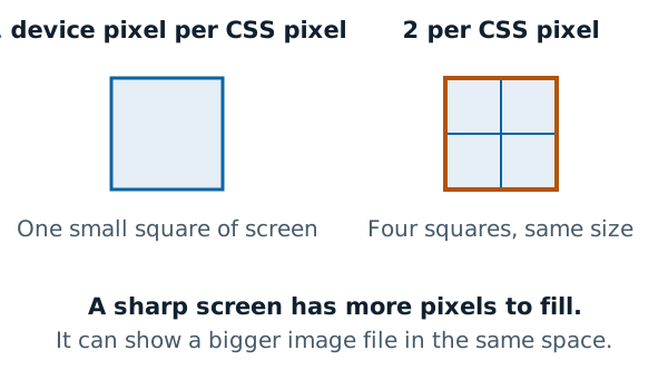
The simplest way uses x labels in srcset, with no sizes. A phone with two device pixels per CSS pixel or more gets the larger file.[2] A normal screen gets the smaller one. The picture shows the same size either way, but the sharp screen shows more detail.
Problem two: the right crop (art direction)
Sometimes a smaller copy isn't enough. A wide landscape photo with a person in the middle becomes tiny on a phone, and the person is hard to see.
Serving a different crop for each layout is commonly called the art direction problem.[2]
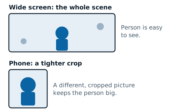
The picture element solves it.[2] It wraps one or more source tags and one img:
<picture>
  <source media="(width < 800px)" srcset="photo-close-crop.jpg">
  <img src="photo-wide.jpg" alt="A short description of the photo">
</picture>
The browser checks each source in order. The first one with a true media test is displayed.[2] If none are true, it uses the img.
Never leave out the img. Without it, no images appear.[2] It also holds the alt text.
Use the media attribute only for art direction. MDN says not to use it for plain size changes.[2]
Which one should you use?
- Same picture, different sizes? Use
srcset. - Different crop on small screens? Use
picture.
Either way, check the result. The testing page shows how to drag a window narrow and watch the page adapt.
Sources
- Responsive web design, MDN Web Docs (accessed 2026-11-07)
- Responsive images, MDN Web Docs (accessed 2026-11-07)