 Fits Every Screen
What responsive web design is
Last reviewed
The short version
- A responsive page changes its layout to fit the screen it's shown on.
- It's one page, not a separate phone site.
- Three parts make it work: a fluid grid, flexible images and media queries.
- A designer named it in 2010.[1] The first attempts came earlier.
One page, many screens
People open the same web page on a phone, a tablet, a laptop and a TV. Each screen has a different width. A page that only looks right on one of them is a problem on the others.
Responsive web design (often shortened to RWD) fixes this. It's an approach that makes a page work across the full range of devices and sizes.[2]
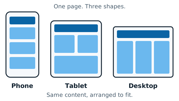
Notice that the content doesn't change. The phone shows the same boxes as the desktop. Only the arrangement changes.
Why a fixed width fails
You could build a page exactly 1000 pixels wide. On a big monitor that leaves a lot of empty space. On a phone it's far too wide.
MDN, the web docs from Mozilla, says this plainly. A fixed width leads to scroll bars on narrow devices and too much empty space on wide screens.[2]
Here's the same article on Wikipedia in a wide window:
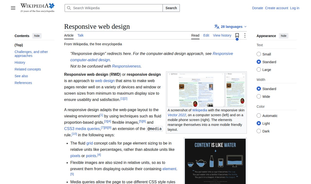
And in a narrow one. The text, menu and pictures have been rearranged into one column:
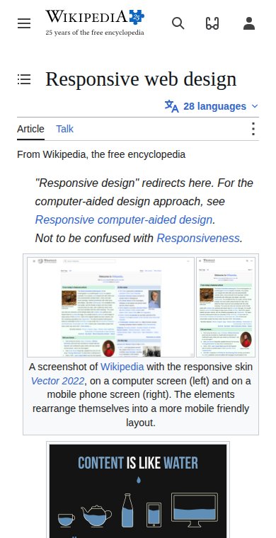
Wikipedia's current look, a skin called Vector 2022, is a responsive one.[1] One page adapts to both widths.
A technique, not a tool
Responsive design isn't a separate technology. It's an approach, made from ordinary HTML and CSS.[2] You don't install it. You build pages in a certain way.
The three parts
In 2010, a designer named Ethan Marcotte gave the idea its name.[1] His version used three things: fluid grids, fluid images and media queries.[2]
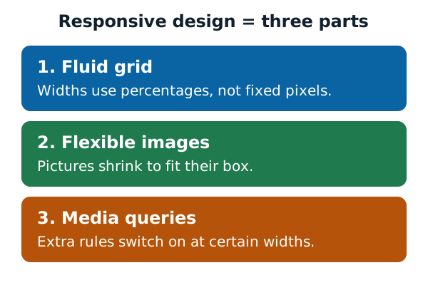
Here's what each one means:
- A fluid grid sizes page elements in relative units, like percentages, not fixed units like pixels.[1] The fluid layouts page shows how.
- Flexible images shrink so they never stick out of their box. The images page covers this and more.
- A media query is a rule that switches on only for certain screens. See media queries and breakpoints.
One more thing sits underneath all three. Phones need a small tag in the page head to report their true width. That's the viewport tag.
Where the idea came from
Marcotte didn't invent flexible pages from nothing. Wikipedia names an Audi website as the first major site with a layout that adapted to the browser width. It launched in late 2001.[1] By 2008, people already used words like "flexible", "liquid" and "fluid" for such layouts.[1] Marcotte gave the whole approach one name.
The need grew as phones spread. Responsive design became more important once mobile users made up most website visitors.[1]
Next, learn the small tag every responsive page needs: the viewport tag.
Sources
- Responsive web design, Wikipedia (accessed 2026-11-11)
- Responsive web design, MDN Web Docs (accessed 2026-11-11)